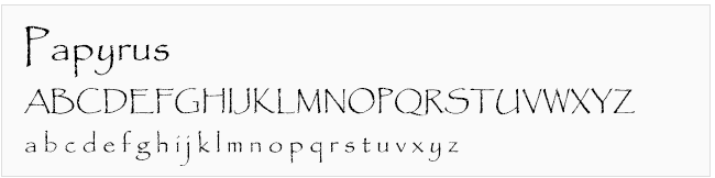
While out shopping for birthday cards, my daughter showed me a card and said, “How about this one?” I took a millisecond glance and replied, “Nope. I hate that font.” We both burst out laughing at the absurdity of my stubborn opinion. But seriously folks, greeting card designers should know better than to use the Papyrus font. Have you seen the video from Saturday Night Live about Papyrus?
Loved and hated fonts vary from person to person, but the fact is that fonts really do matter when you're promoting your business. Just like music and fashion, the popularity and “acceptableness” of fonts changes over time and there are appropriate and inappropriate uses. You wouldn't play La Macarena at a funeral, and you wouldn't clean your garage wearing a tuxedo. Similarly, you shouldn't use Comic Sans for a business website (or ever), or use Verdana to promote a high end product.
Making a more professional choice in fonts
What to do if you're not a designer, but still need to create professional-looking content? Here are a few general rules to follow:
- DON'T USE: Fonts that look like handwriting, unless you are designing a comic book layout.
- DON'T USE: Fonts that have a “curly” or “cute” look to them.
- DON'T USE: Fonts that have a big difference in line thickness, where part of it is a fat line and part is a very thin line. These types of fonts can easily become unreadable on websites.
- DO USE: Simple, sans serif (without “feet”) fonts. These are the easiest to read on websites. You want your message to stand out, not your choice of fonts.
- DO USE: 1 or 2 fonts per page. If you opt for 2, use one for headings and another for body content.
- DO USE: Varying weights (black, bold, regular, light) and sizes instead of multiple fonts. Your design will look more cohesive.
- DO USE: Plenty of white space and line spacing. Even nice fonts look bad when overcrowded.
8 fonts you should avoid using for business websites (or any business marketing, really)
Avoid these fonts because they are unprofessional…
These first 5 fonts are among the most hated by people who know fonts. They are a very quick way to make your business look unprofessional:
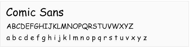
- Comic Sans – the most mocked font in the world, comic sans is extremely unprofessional
- Papryus – a close second in the “most mocked” category
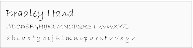
- Bradley Hand – like Comic Sans, Bradley is childish and not suitable for business use
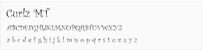
- Curlz – illegible and screams 4-year old maturity level
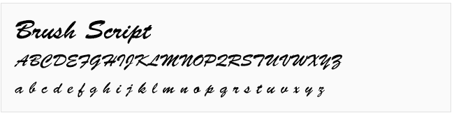
- Brush Script – Very difficult to read, and amateurish
Avoid these fonts on your website because they look outdated…
The next 5 fonts used to be old standbys on websites back when we only had a handful of “web-safe” fonts that would display correctly across different computers. Those days are gone and using these fonts in this decade makes it look outdated:
- Impact – nowadays Impact is most often used on memes, you don't want to become a meme

- Verdana – Verdana was a favorite web font for readability in the late 90s, so it now look outdated. However, it is still a good font to use for “fine print” because it remains legible at small font sizes.

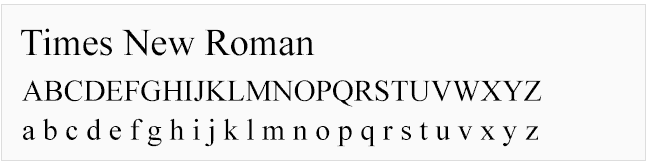
- Times New Roman – poor readability online due to the thin serifs (“feet”) on the letters. It also looks amateurish and outdated because it's a default font
BONUS – Three more to avoid that aren't bad, just overused
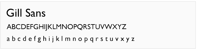
- Gill Sans – one of the most popular web fonts, it was overused in the early 2000's and now has a dated look (but hey, Crocs are coming back, so you never know!)
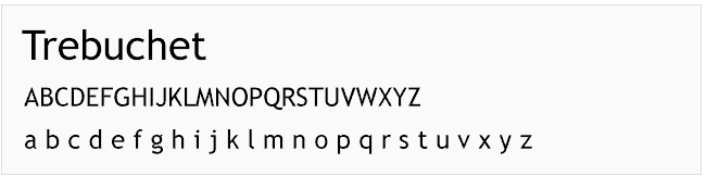
- Trebuchet – not a bad font, it just went out of fashion and now looks dated on websites
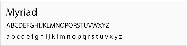
- Myriad – not a bad font per se (I kind of like it, actually), but as the default font in Adobe products, it says “Amateur” or “I didn't care enough to change the font”
Font confessions…
I must admit that there was a time early in my career when a client insisted on comic sans for a project, and I caved. In my defense, it was a child-centered business, but let's just say it never made it to my portfolio. What about you? Any font confessions or opinions on the good, bad, or ugly?
Does anyone else have that blasted Macarena song stuck in their head now?
Next up in the blog: What fonts DO look good on websites?
Would you like to receive more website and design tips from Surelutions? Sign up below:
By clicking subscribe, you are signing up to receive emails from Surelutions. You will receive an email to confirm your subscription. We only send emails we think will be of interest to you, and do not share your You may unsubscribe at any time.